🎉 BOGO Summer Sale: Buy Any Eligible Course, Choose Another FREE!
Your free course will be added to your account within 24 hours. Contact us after purchase to choose your complimentary course.
Member's schedule
Log In
Right-click and open in a new tab to enlarge and print.
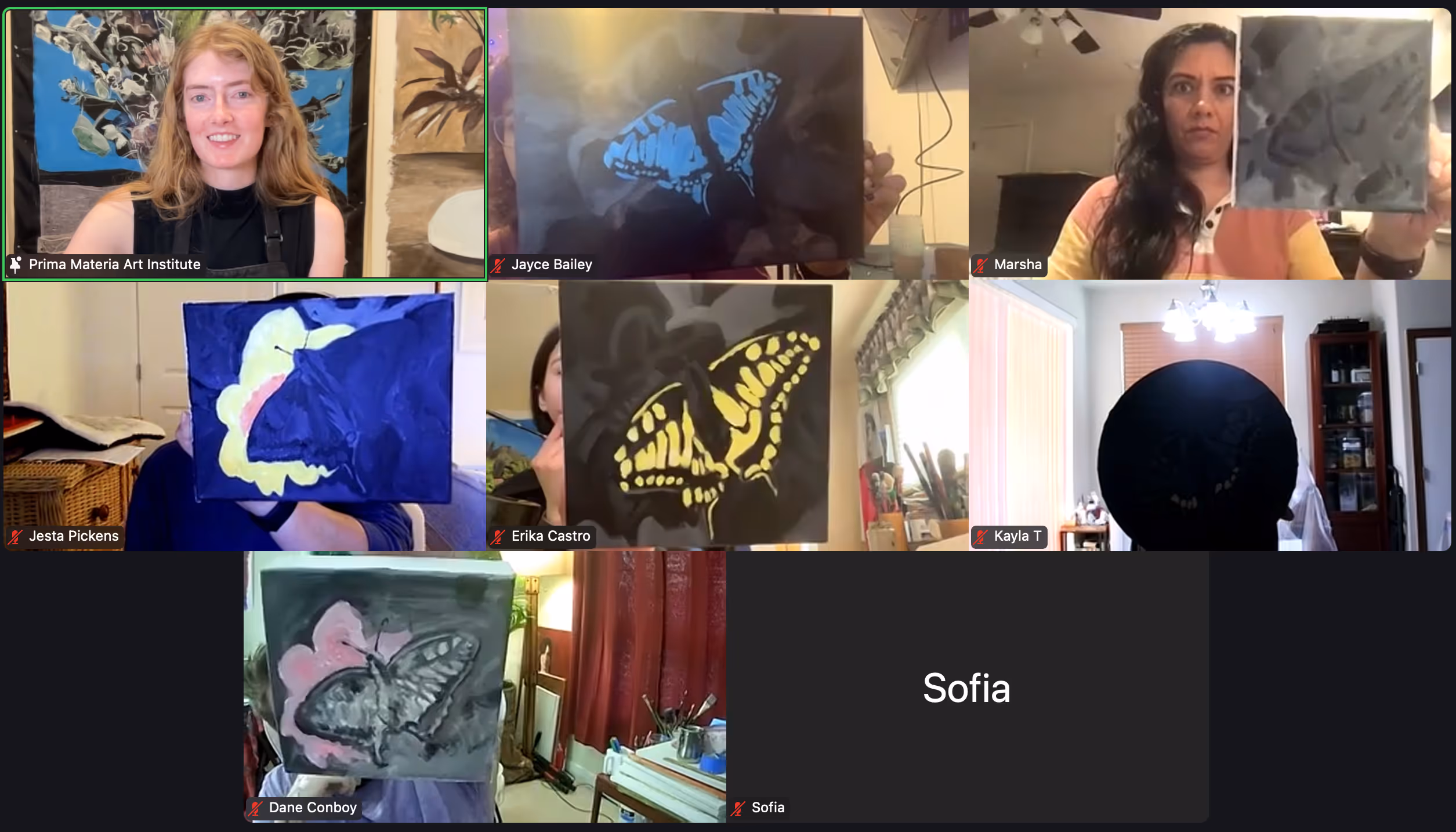
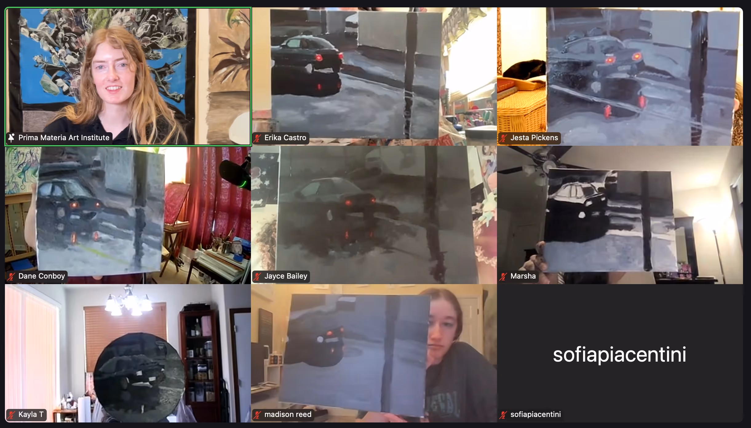
Choose your photo reference and the size of your canvas and begin sketching. Make sure your photo matches the ratio of your canvas before you begin drawing. We'll begin painting next week, although you're welcome to paint in between now and part 4.
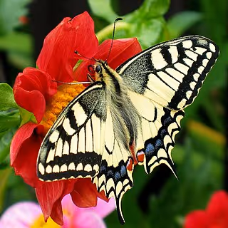
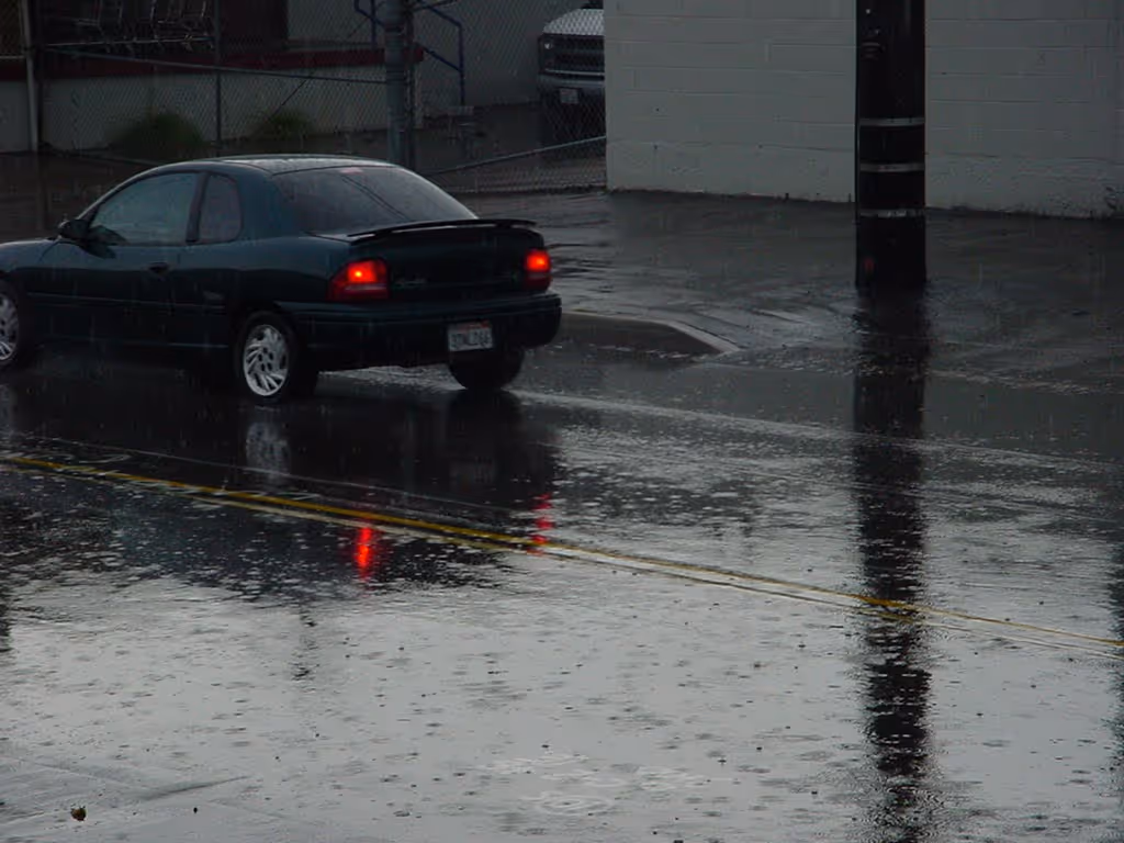
You can choose any photo - it doesn't have to have any glow in it in order for it to work with the technique, and it doesn't have to be an "interesting" image - it could be a picture of your shoes after a hard days work; by making an area glow, you make your piece meaningful and captivating.
Although the second class now used the entire palette, the way to create a fluorescent glow remains toning everything except the glowing areas down to an almost unbelievable degree. The difference between week 1 and week 2 is that in week 2, you also have to think about temperature and hue, not just tonal values.
To prepare for week 3:
Find a few photo references that you'd like to paint for the rest of the course. Preferably your photos should have high contrast, but the subject matter can be of anything! They do not have to have any "glow" already in them for it to work for this course.
Practice creating a faux glow with a grisaille and a pop of color. In order to make your tints feel like they're fluorescent, you must tone your grisaille down so that your "whites" are medium-grey. Your tints need to be even lighter than the lightest grey.
Definitions:
Want a closer look? Right-click and open in a new tab to view.