🎉 BOGO Summer Sale: Buy Any Eligible Course, Choose Another FREE!
Your free course will be added to your account within 24 hours. Contact us after purchase to choose your complimentary course.
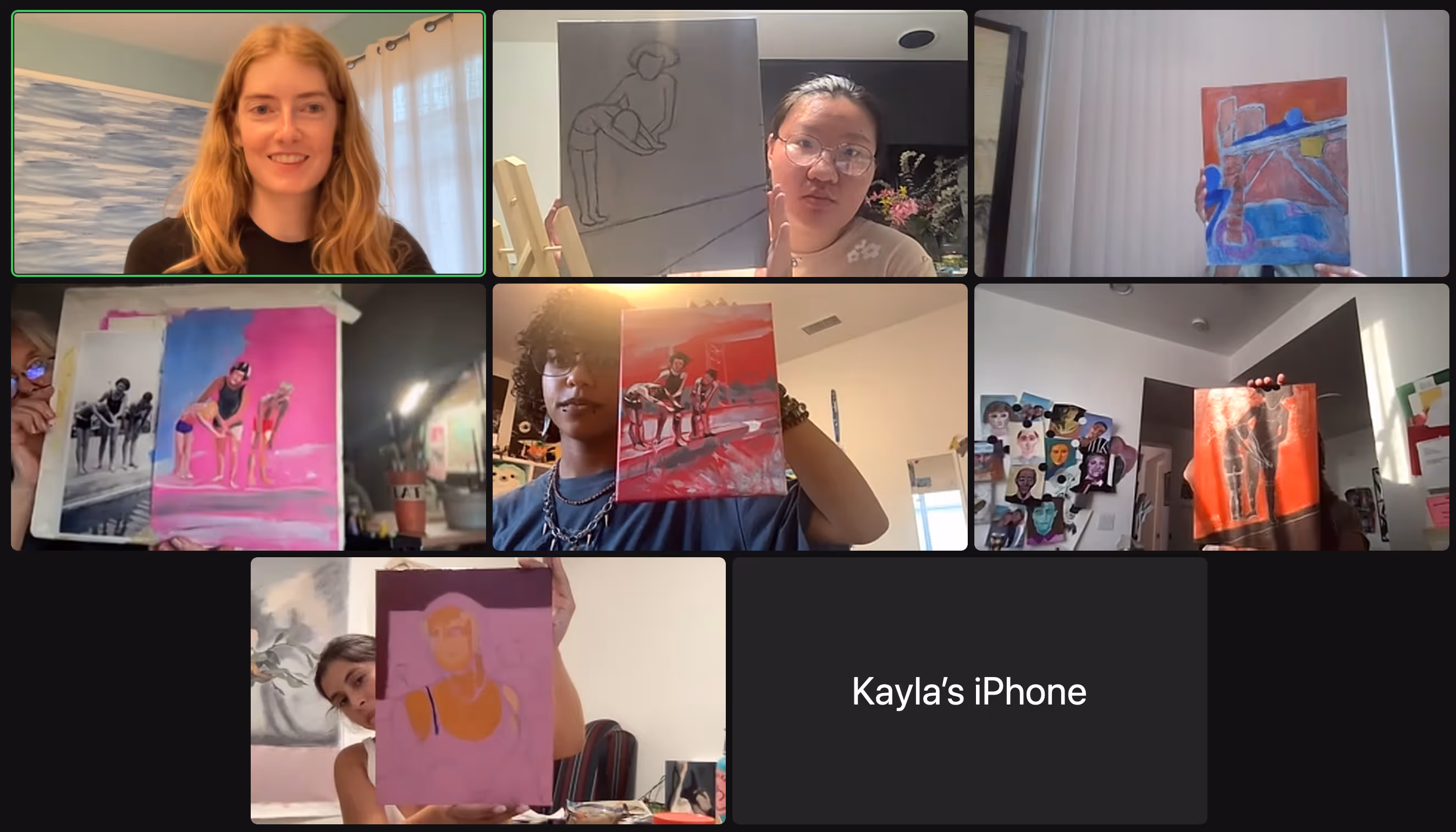
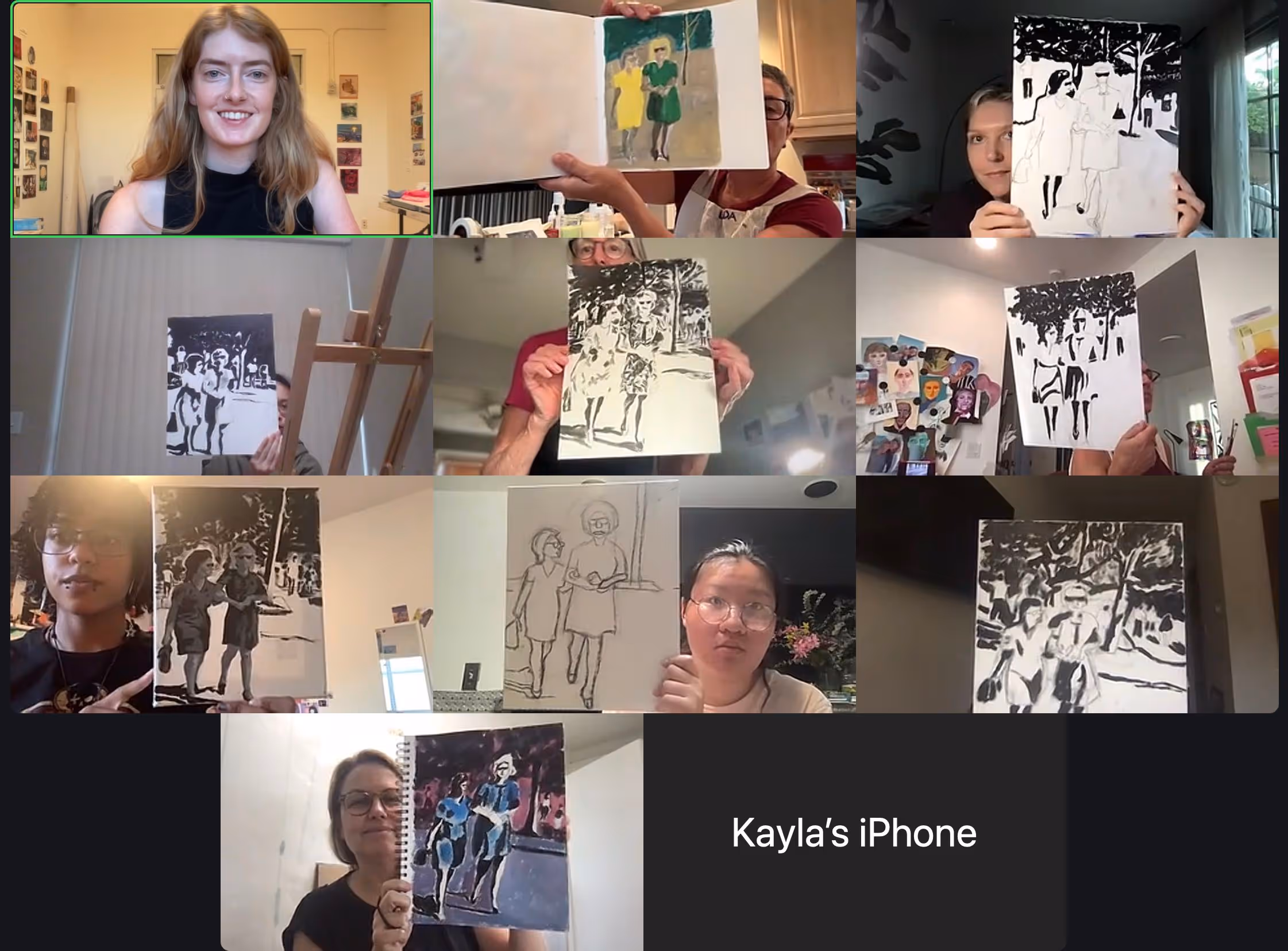
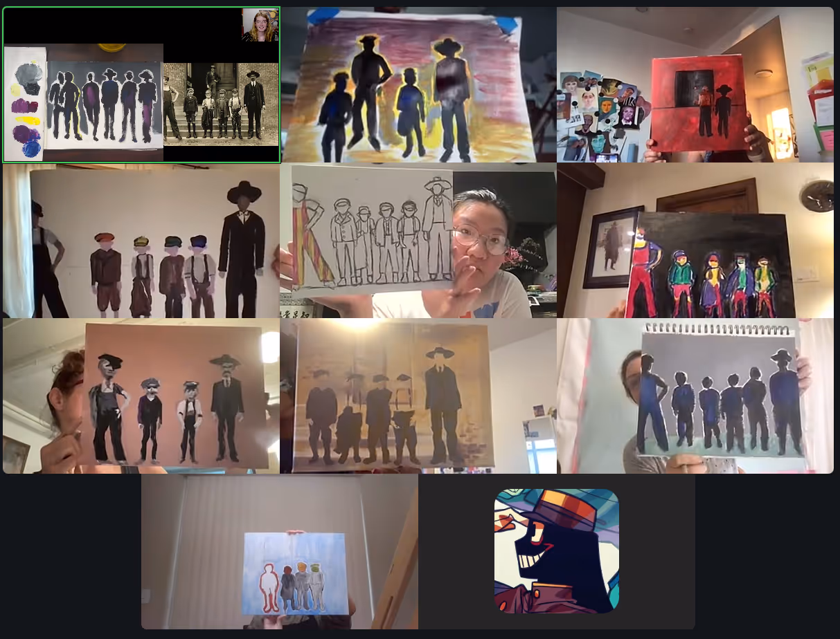
Member's schedule
Log In
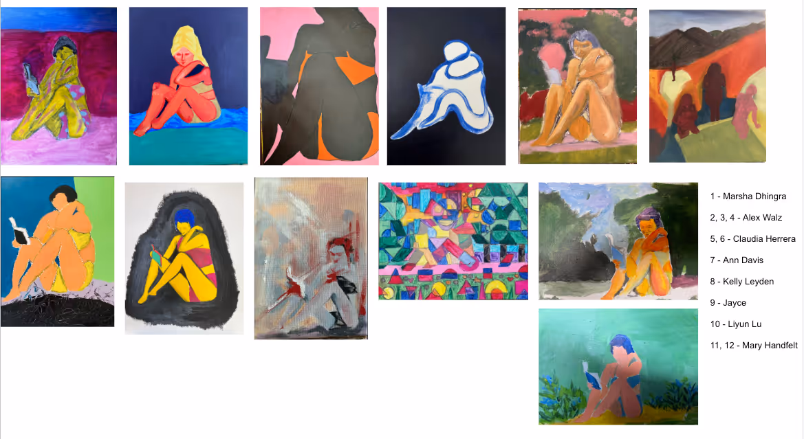
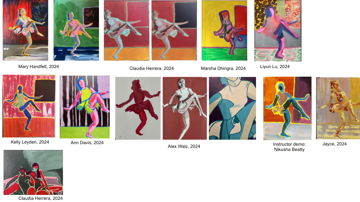

Right-click and open in a new tab to enlarge and print.
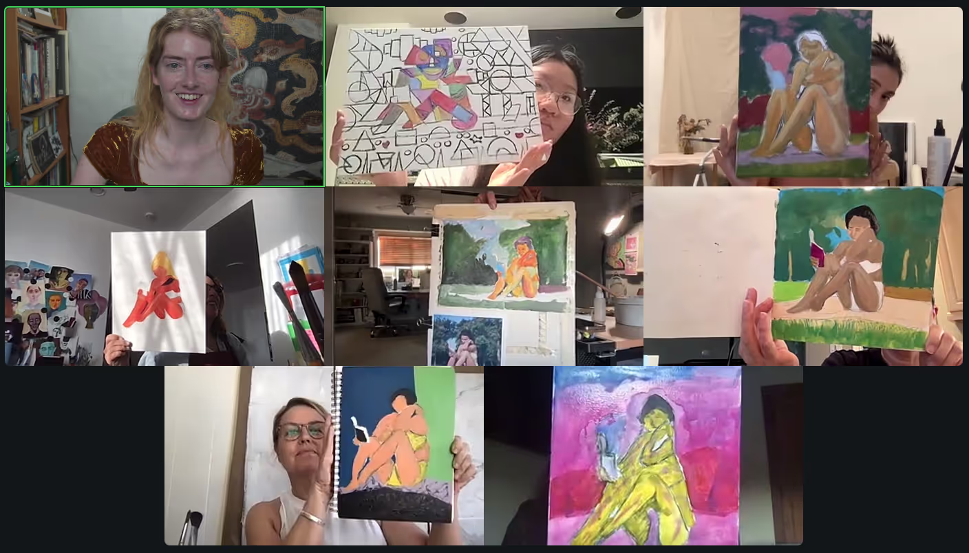
Benefits of beginning with a high contrast black and white underpainting that focuses on tonal relationships:
1. it will train you to pay attention to tonal values on the subject-matter,
2. it will help you mix your colors while minding the color’s tonality,
3. you’ll achieve a greater 3-D effect,
4. It will help you overcome the psychological resistance to using black paint.
After you're done with your black and white underpainting, you can colorize and add details. Paint with opaque layers and/or transparent layers: scumbling or glazing.
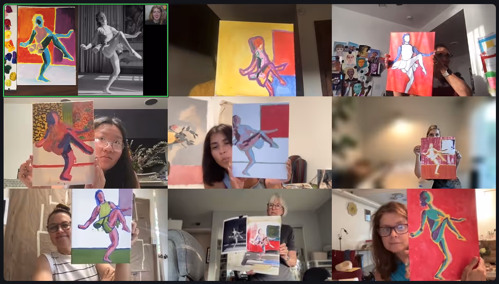
What to think about when painting on top of an imprimatura (toned canvas).
Continue experimenting with the watered down paint technique.
What to explore:
How to prepare for week 4:
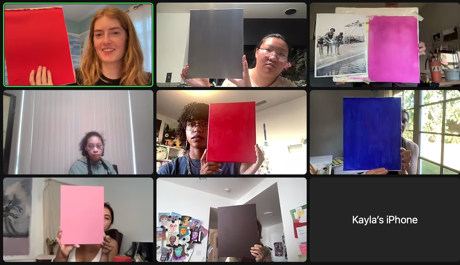
Paint your entire canvas a solid color that is not skin tone.
Psychology of color
Reminders for when you're painting:
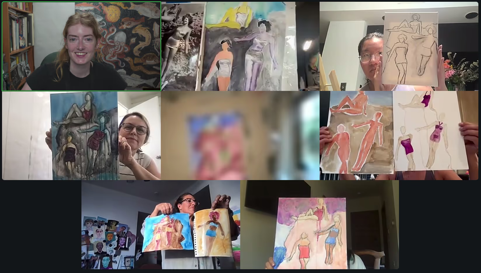
If you want to use your own photo reference, I recommend finding candid images or images that are unusual in some way. Nothing too forced (like a stylish headshot or a posing model) or "pretty". Go for weird, for natural. Maybe what can help you pick is to choose something you wouldn't normally think to paint.
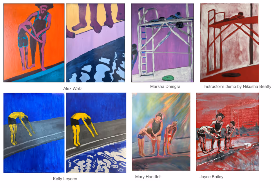
Want a closer look? Right-click and open in a new tab to view.