🎉 BOGO Summer Sale: Buy Any Eligible Course, Choose Another FREE!
Your free course will be added to your account within 24 hours. Contact us after purchase to choose your complimentary course.
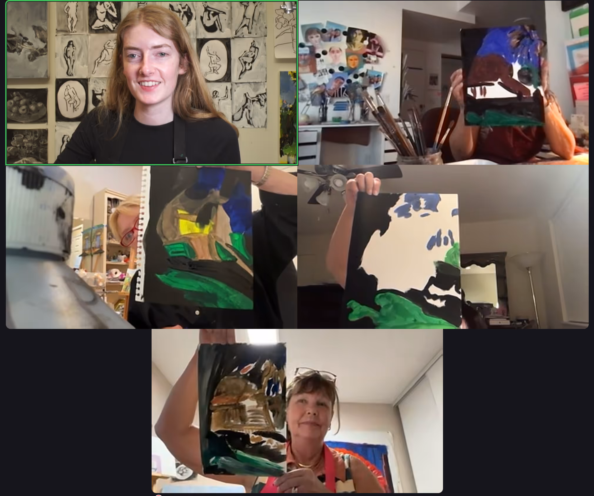
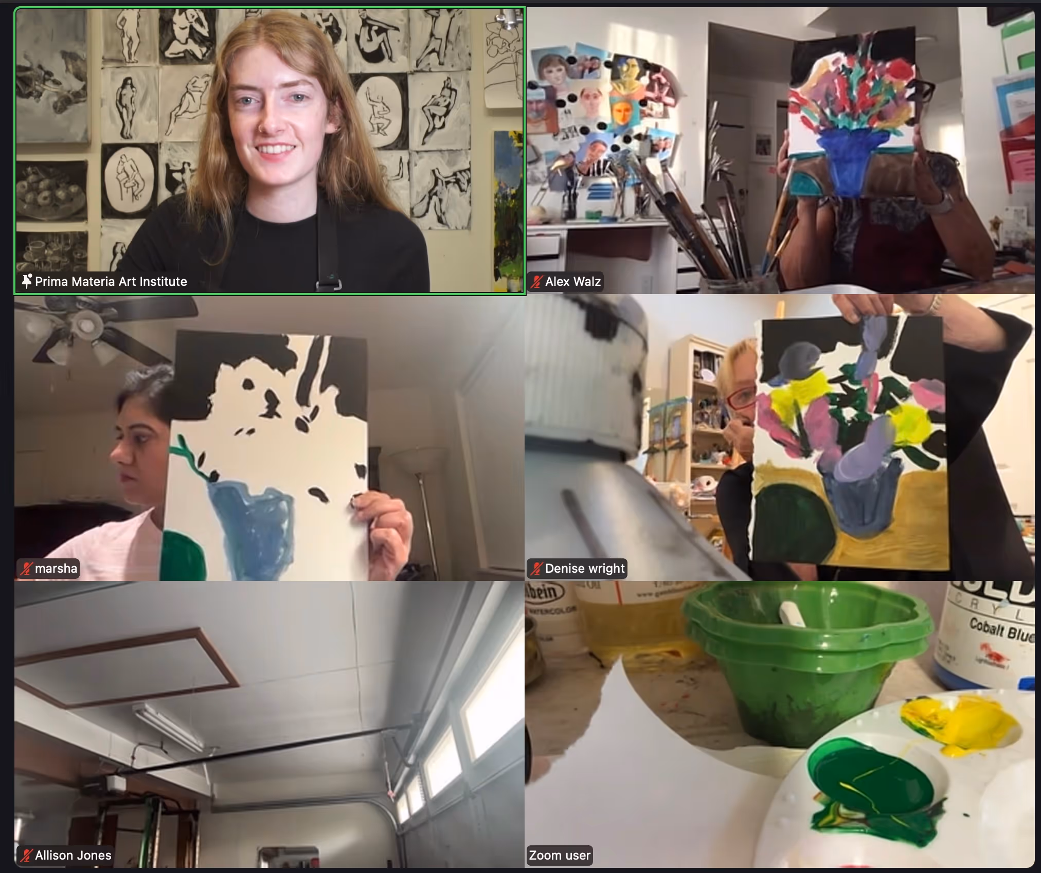
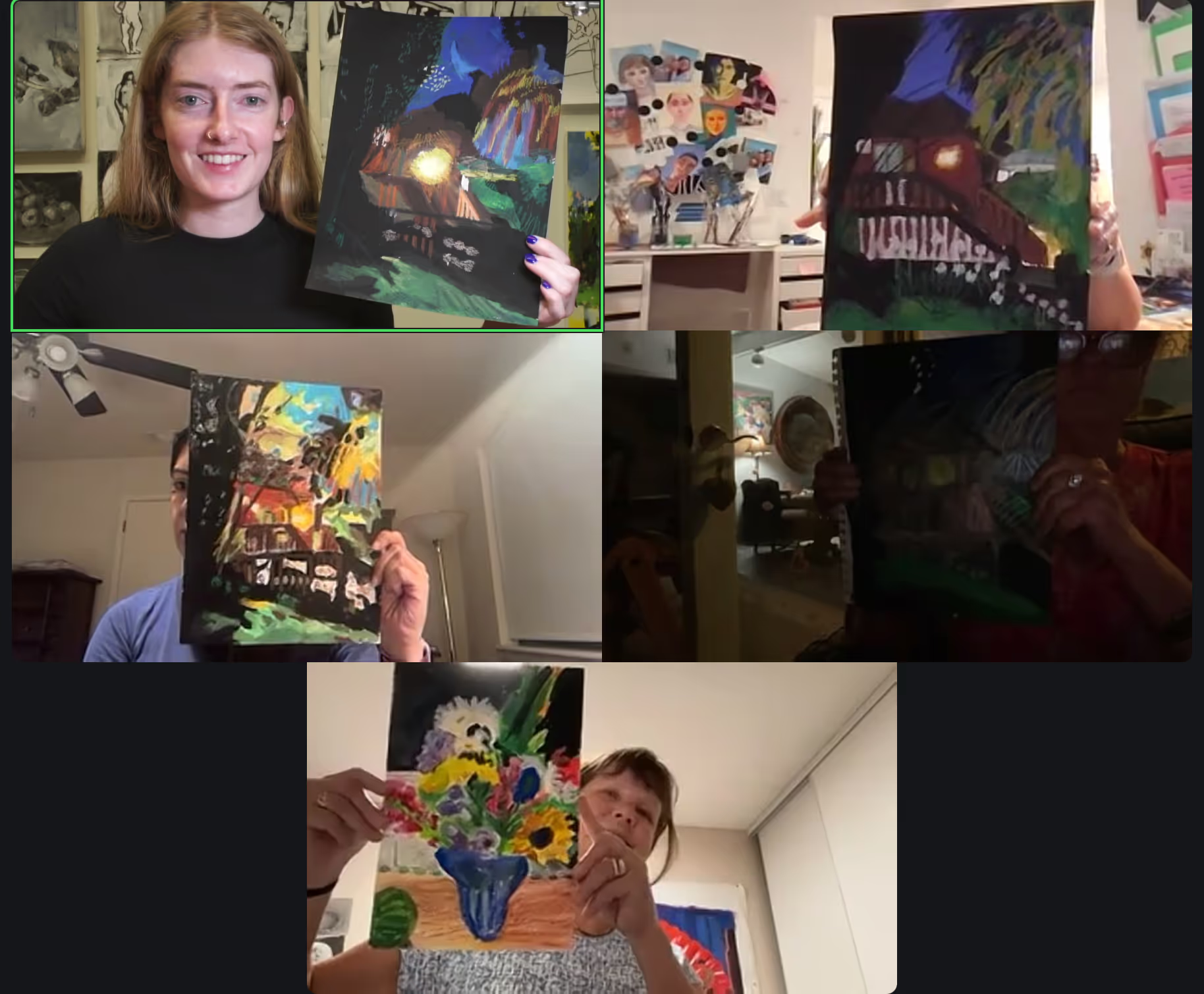
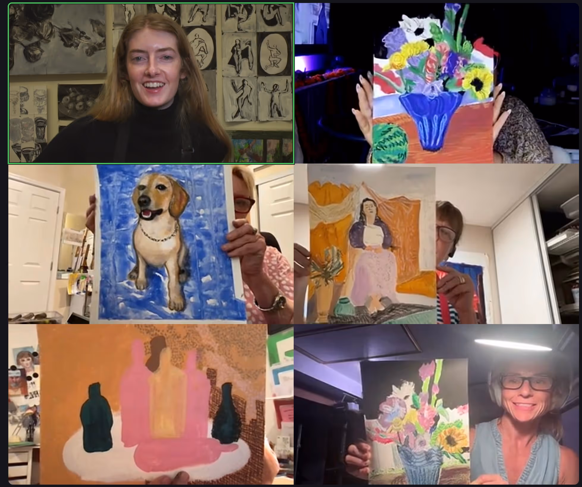
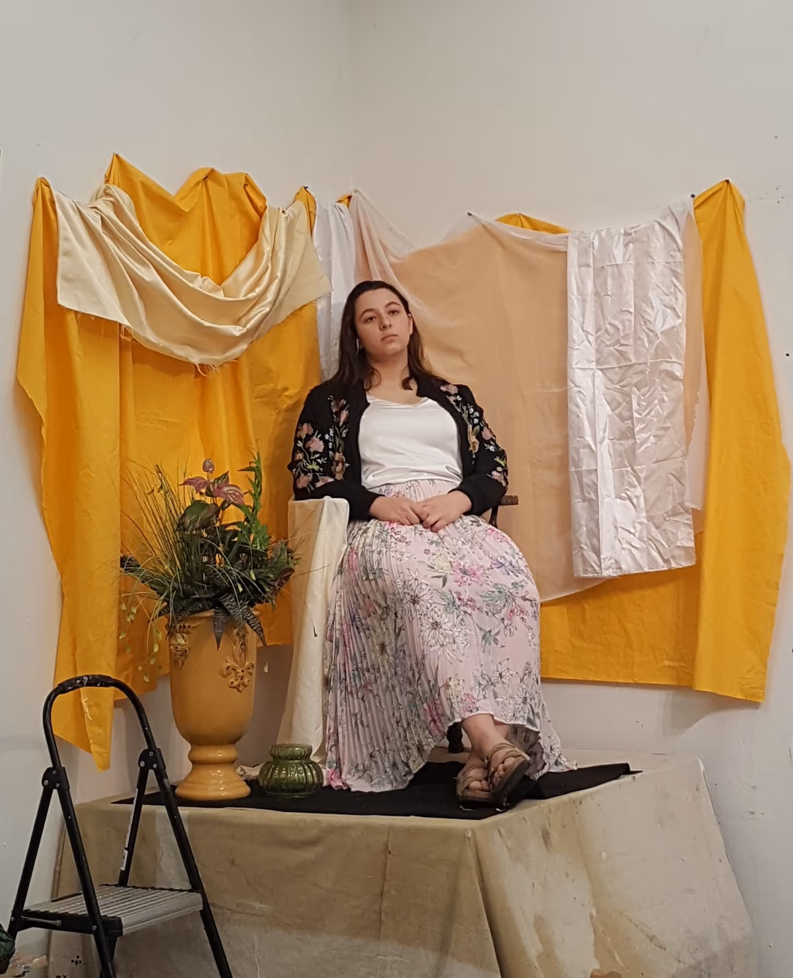
Member's schedule
Log In
Right-click and open in a new tab to enlarge and print.
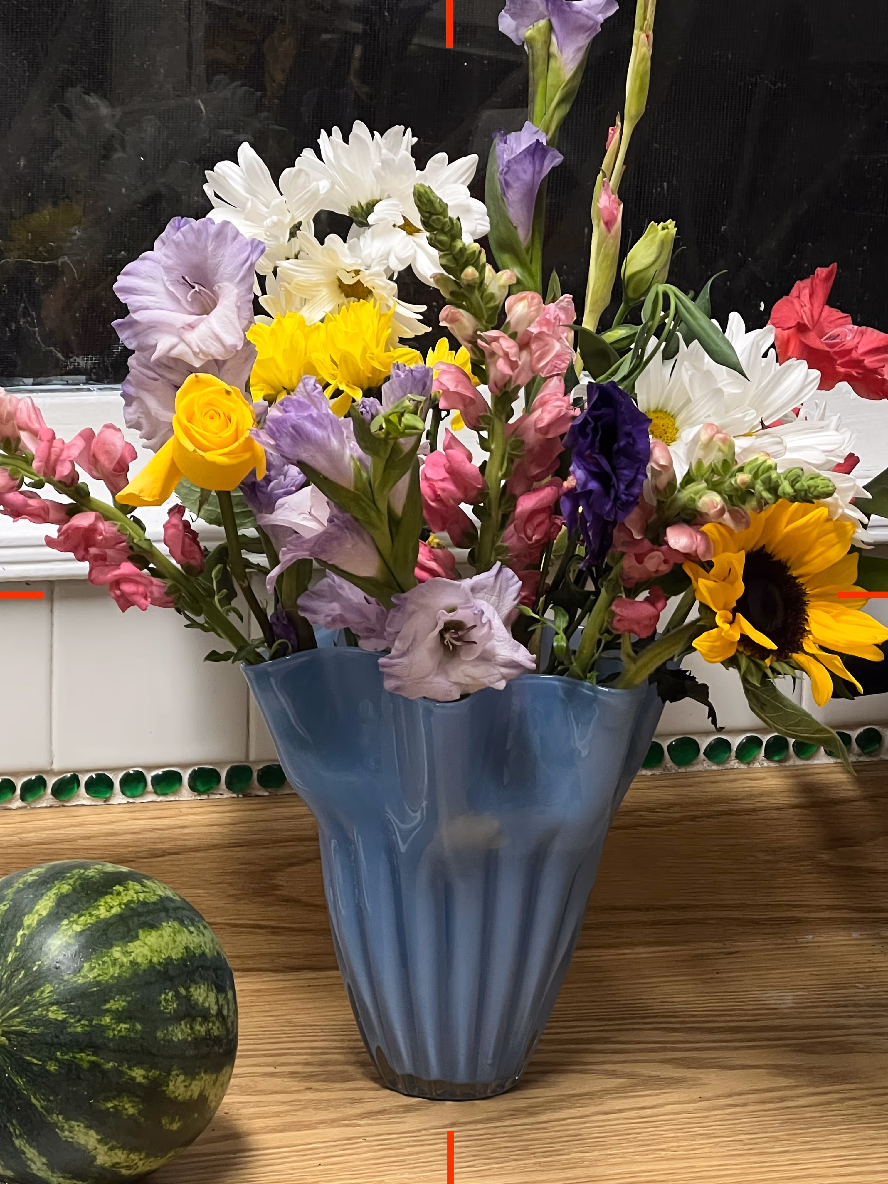
Optical color mixing is a method of layering colors on top of one another so each layer is still visible, rather than blending the colors together. This gives you a high degree of colorfulness, while maintaining tone and temperature.
In order to see how colorful each area truly is, compare, compare, compare! Look at every area in relationship to what you're trying to draw and ask yourself is it lighter or darker, warmer or cooler? You may need to add 3, 5, 6 (or more) layers to finally achieve the trifecta of tone, hue, and temperature.
This approach is difficult! It will take a few attempts to really get a hang of it.
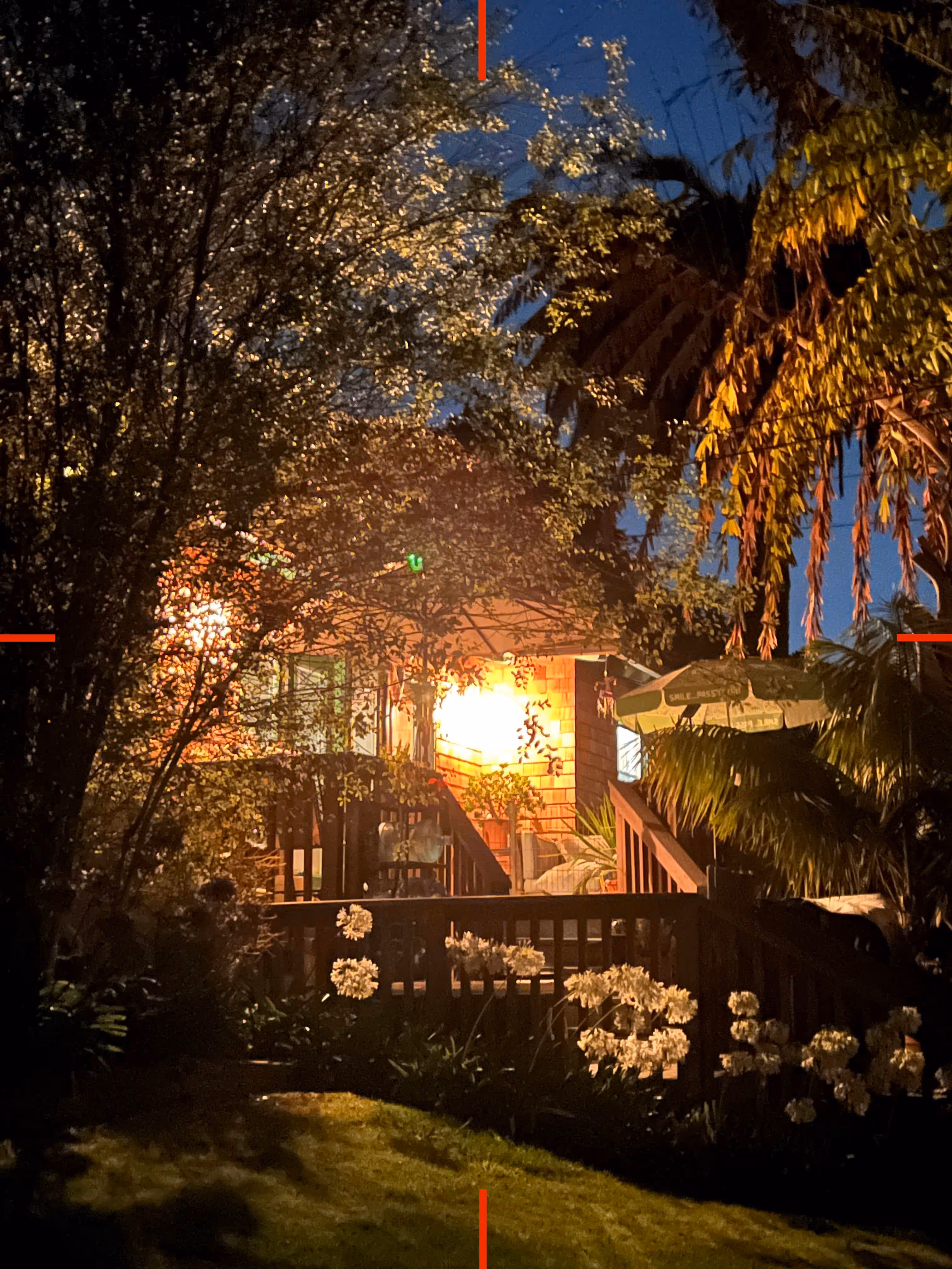
When you add an outline to an artwork, it can very quickly finish a piece. You may be surprised how quickly an artwork is completed when you add a line to define the silhouette and details. Consider in this artwork, less is more. And if you feel it's not quite done - then more is more!
Adding texture to an artwork means deciding how you'll move your hand to express a surface or material. Invent expressive approaches to describe vertical vs horizontal vs rounded vs flat vs fuzzy vs soft vs heavy vs light, etc.
This technique used a very limited palette of just black and white to create dimension, form, texture, and details. Always compare the photo reference and your drawing to know when to use black versus white. If your underpainting is lighter than the photo reference, use black to darken it. If your underpainting is darker than the photo reference, use white to lighten that area. If the tone of the painting matches the photo, you don't need to add any pastel.
Remember that you can use different pressure to change the tone (lightness or darkness) of an area.
Continue drawing with any color of your oil pastels over the underpainting of your choice.
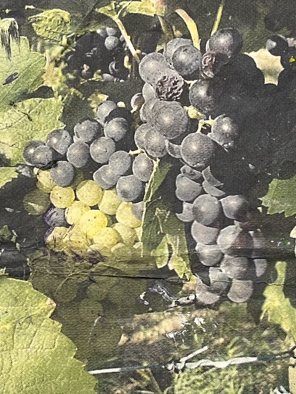
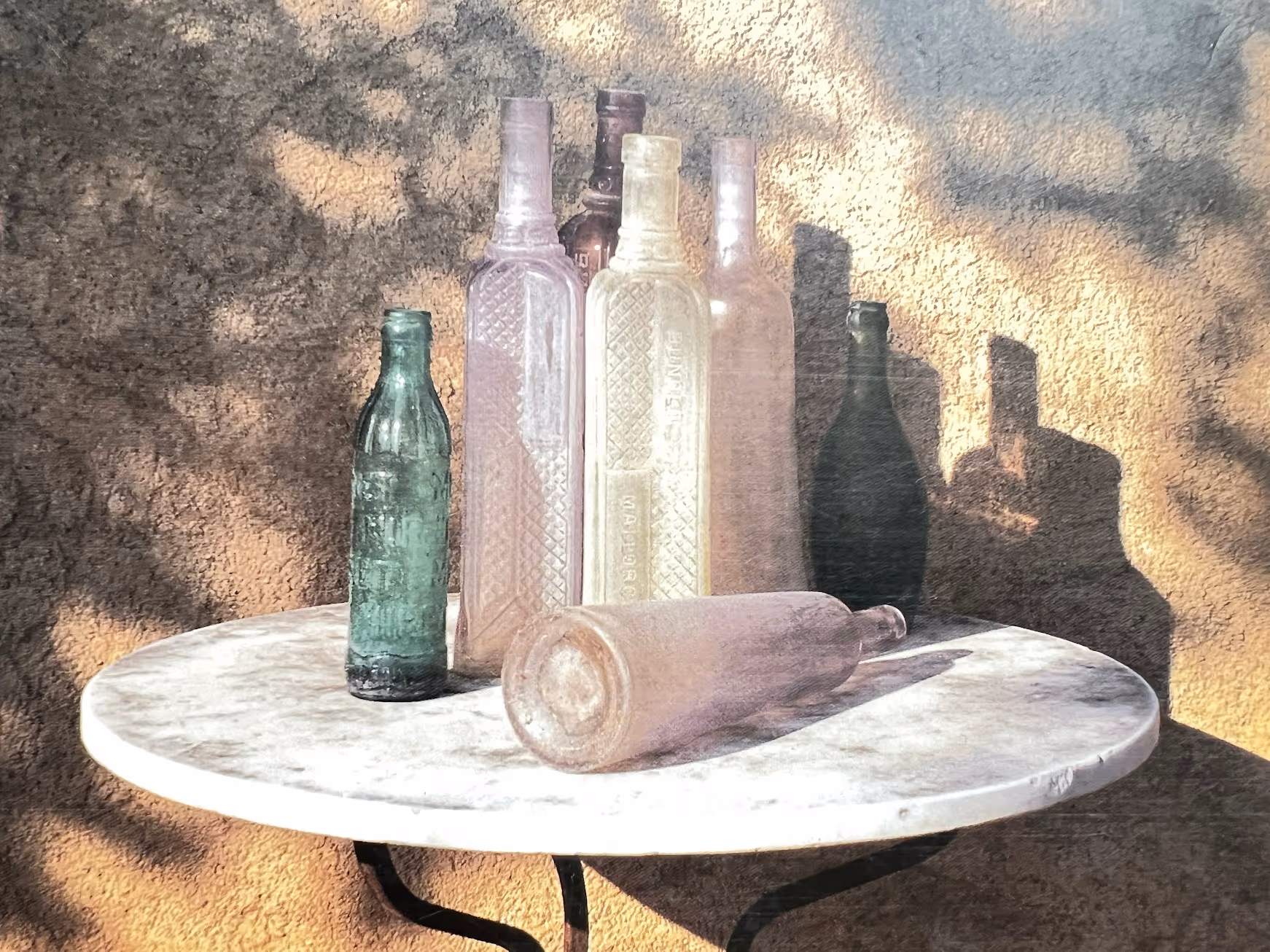
Since we have a week break, feel free to make more underpaintings with the photo references provided and follow the same steps as introduced in class 1. You can create extra paintings with one photo reference, or create up to 6 more paintings, using all the additional photos. It’s up to you. Since every week, you’ll be able to choose your underpainting, having more underpaintings to choose from will be more fun, and actually easier to do. After part 2, you have a better idea of what to expect from this course.
Finish your underpaintings - you should have four in all. Keep two sketchy and painterly. Refine two to make the shapes more distinct.
Want a closer look? Right-click and open in a new tab to view.