🎉 BOGO Summer Sale: Buy Any Eligible Course, Choose Another FREE!
Your free course will be added to your account within 24 hours. Contact us after purchase to choose your complimentary course.
Member's schedule
Log In
.avif)
Right-click and open in a new tab to enlarge and print.
Bring all of your drawings that you have created in the course. You'll have the entire class dedicated to refining the pieces you feel aren't done yet.
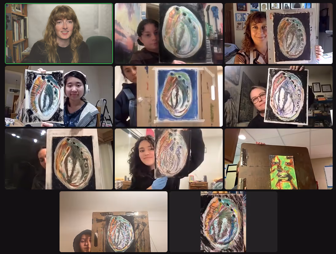
Send me images of all of your drawings from the course - I am putting together an exhibition of all of your artworks. This will also help me give feedback to you since the pictures will be high quality compared to Zoom.
In preparation for week 5, you'll need four sheets of paper. You can either use 4 full sized sheets of pastel paper OR cut two pastel sheets in half to become 6x9".
Each sheet will be a different color: bright green, dark green, yellow, and light, bright blue (like the clear blue sky).
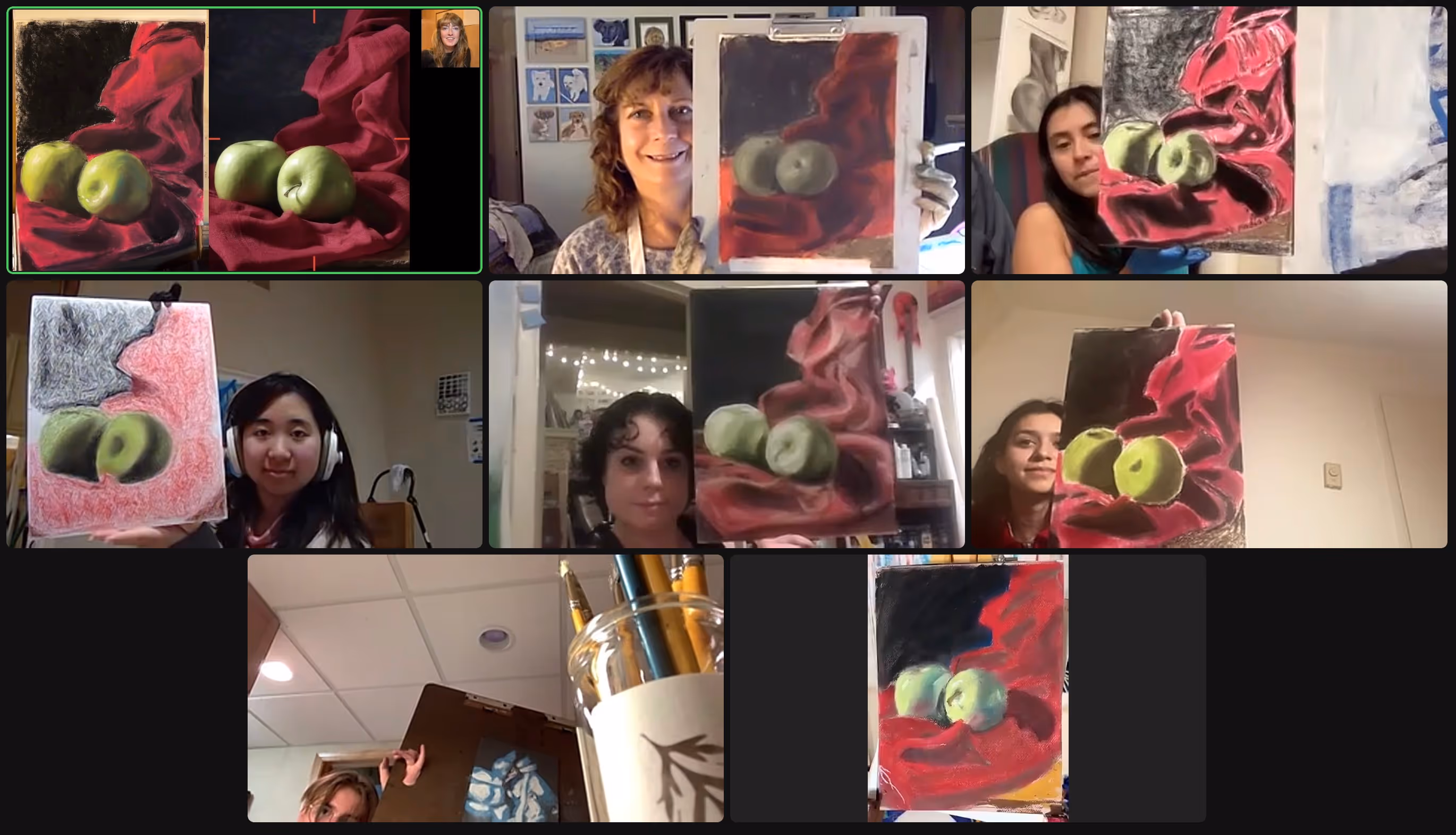
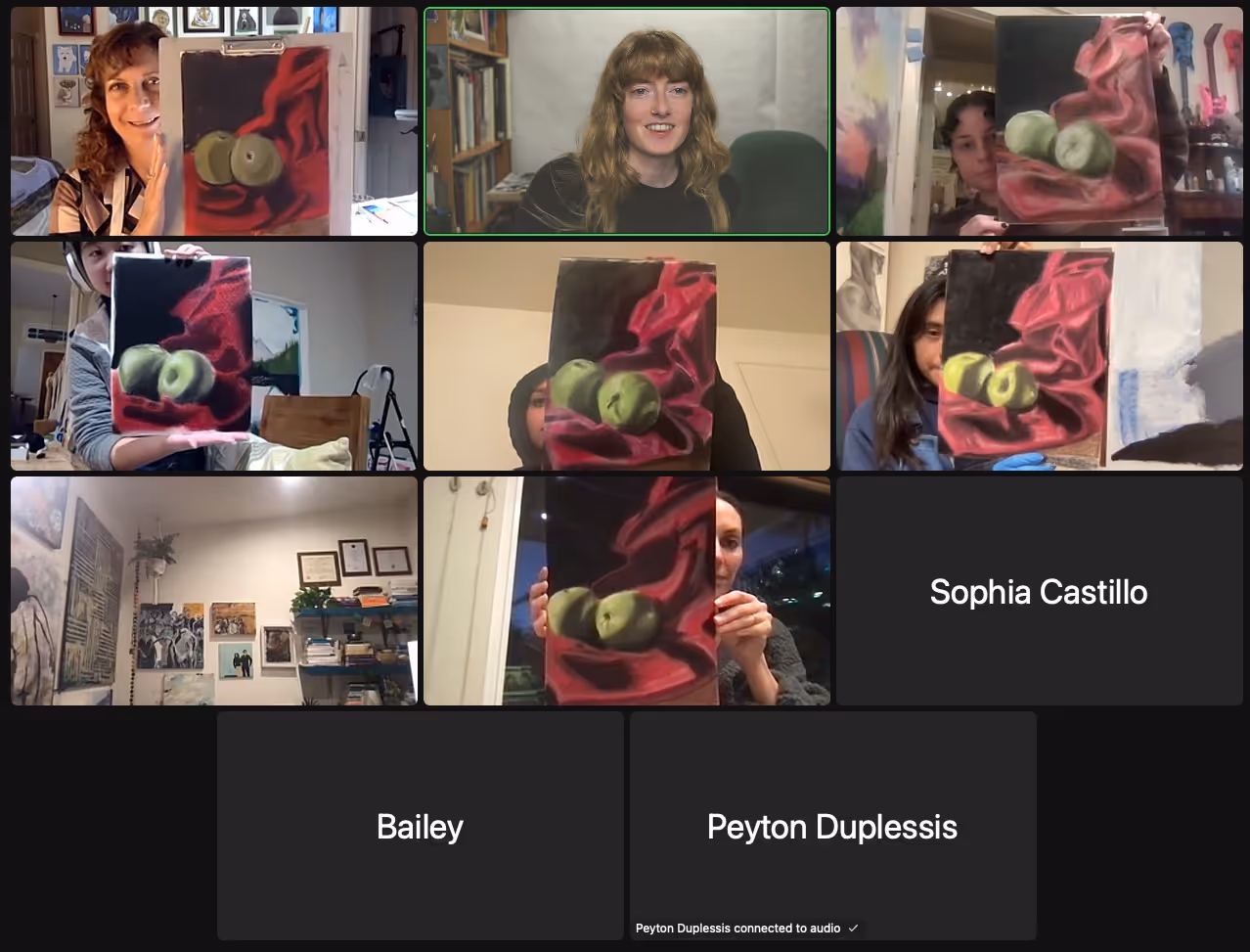
Finish your layering drawing. Pay attention to tone (light or darks), saturation (bright or dull), and temperature (warm or cool).
Before next week (week 4):
When you add water to paper, it will curl. You'll want to tape all around the borders of your paper to a sturdy support board.
Continue blending your drawing. The goal is to get rid of any pastel lines and hard transitions between shadows so that you achieve a soft gradient. It takes time. Be patient. You'll be rewarded!
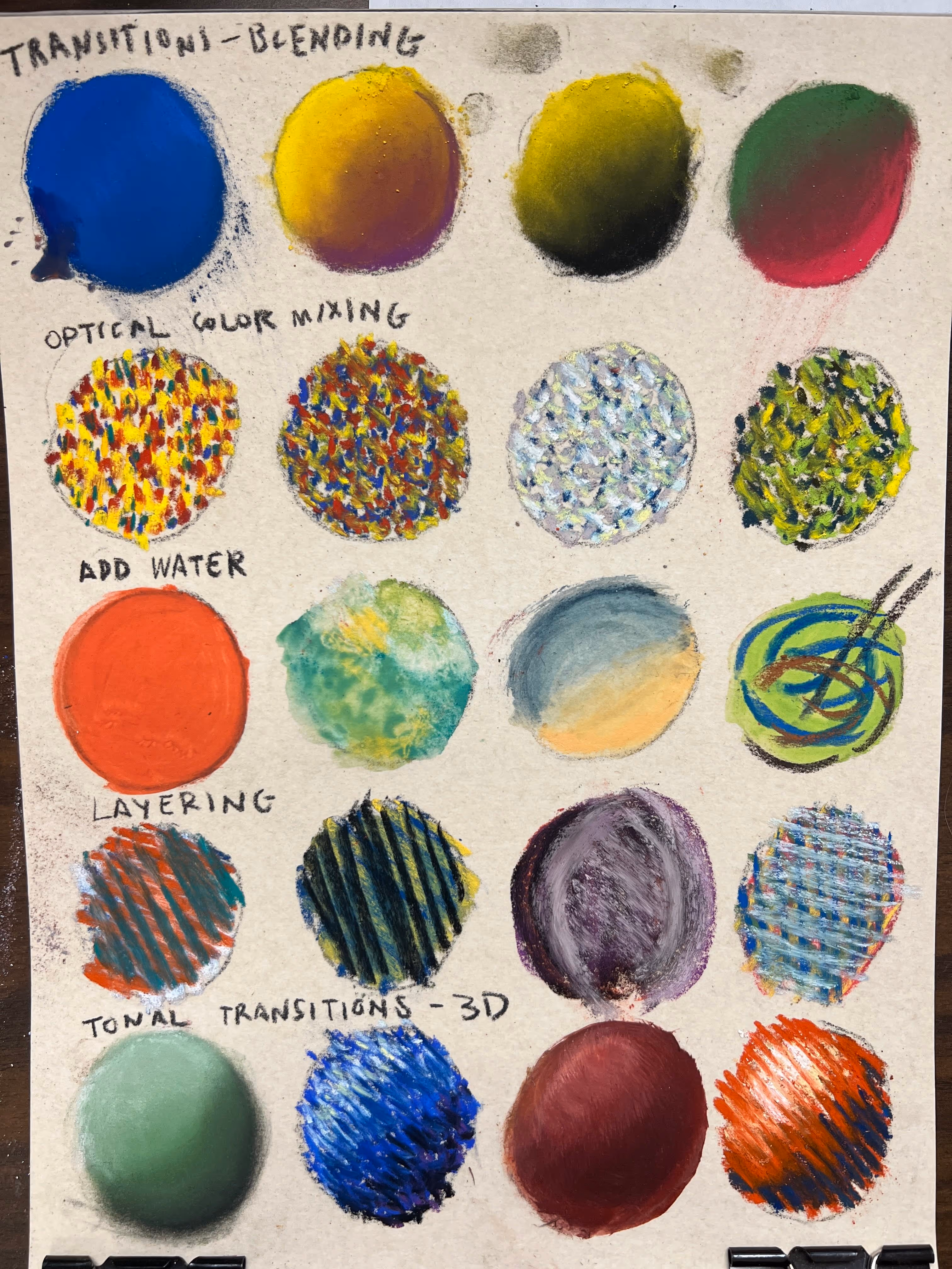
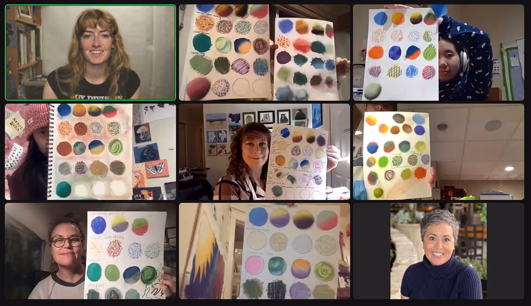
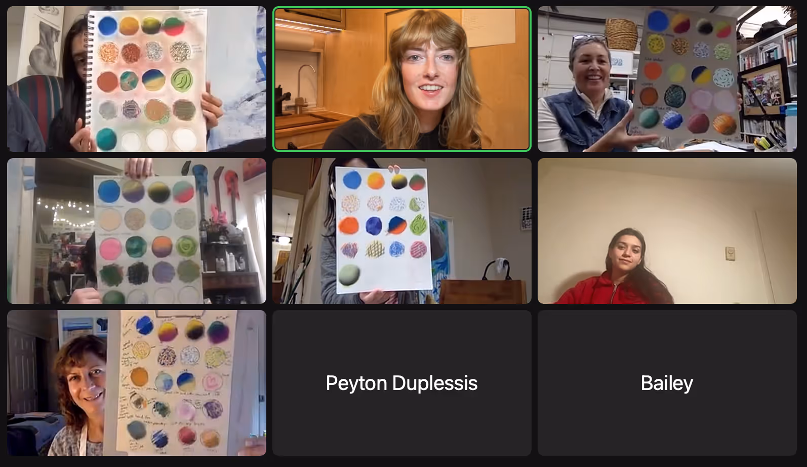
Complete your color chart before next week's class.
The last row is about tonal transitions to create a 3D sphere:
Want a closer look? Right-click and open in a new tab to view.
Something else I wanted to mention in class that I forgot about was the ability to create your own pastel paper! If you already have a bunch of drawing pads, you can purchase pastel ground or pumice gel and add layers to your paper to create your desired tooth / grit. Keep in mind that this can cause your paper to warp so you'll want to be aware of that. You can prevent warping by painting the back of your paper with gesso, for example.
If your drawing pad has glassine, it can preserve your drawing without the need for framing or spraying. Glassine doesn't attract soft pastel dust to it.